

Beautiful, customizable floating snackbars / toasts for Flutter. 🚀
Keep the dead-simple one-liner you already know - or reach for variants, positioning, theming, actions, progress bars, and context-free display when you need them. Pure Dart, zero native code, works on every platform.
| Android | iOS | Linux | macOS | Web | Windows |
|---|---|---|---|---|---|
| ✅ | ✅ | ✅ | ✅ | ✅ | ✅ |
Example app |
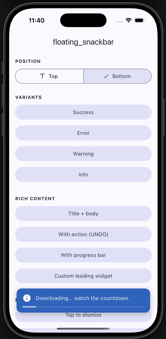
Progress |
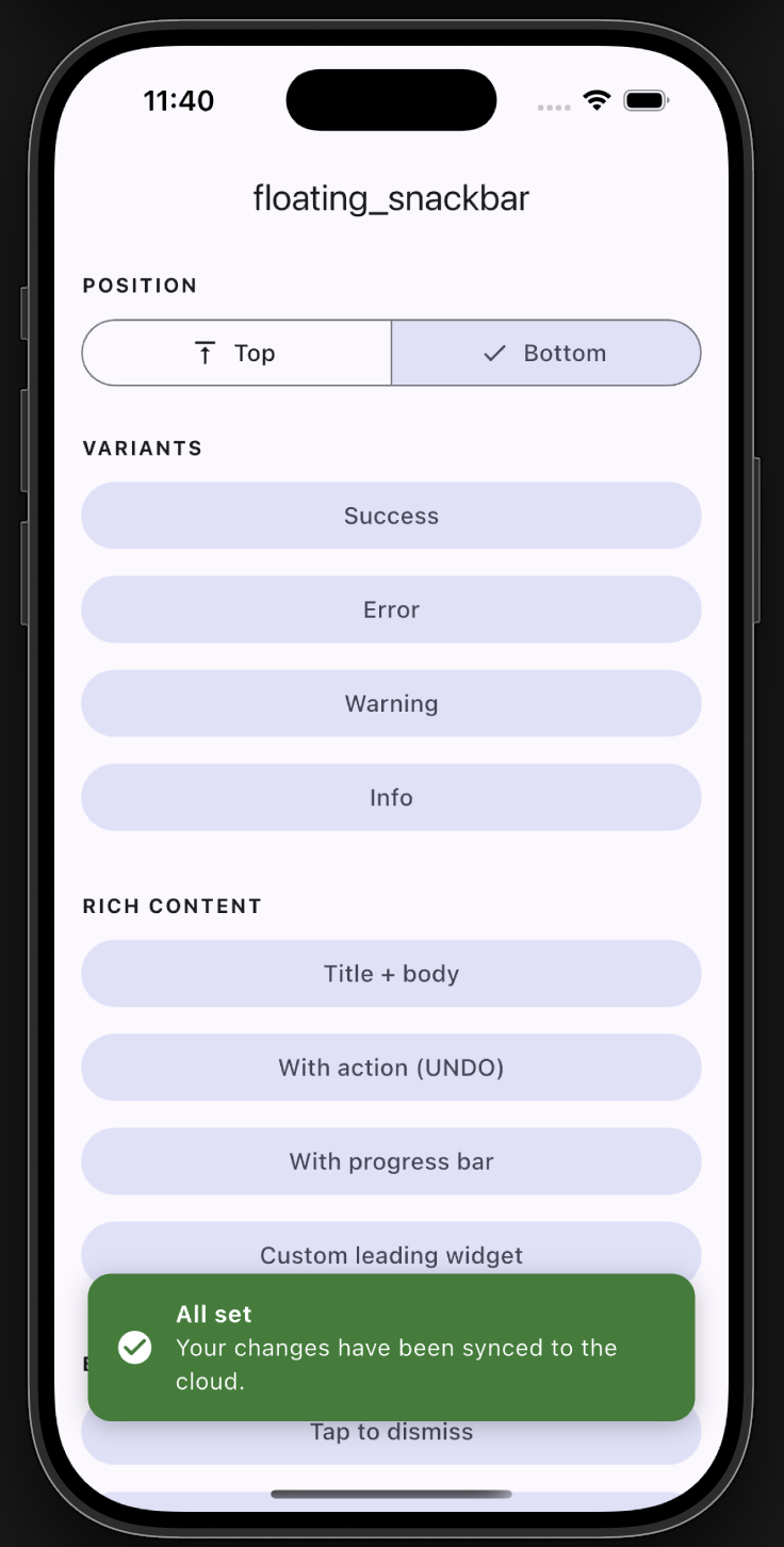
Bottom with title |
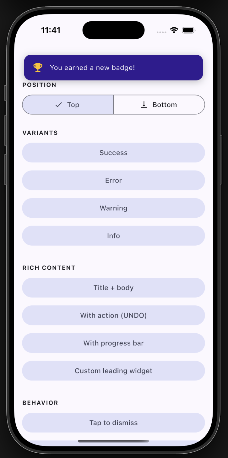
Top position |
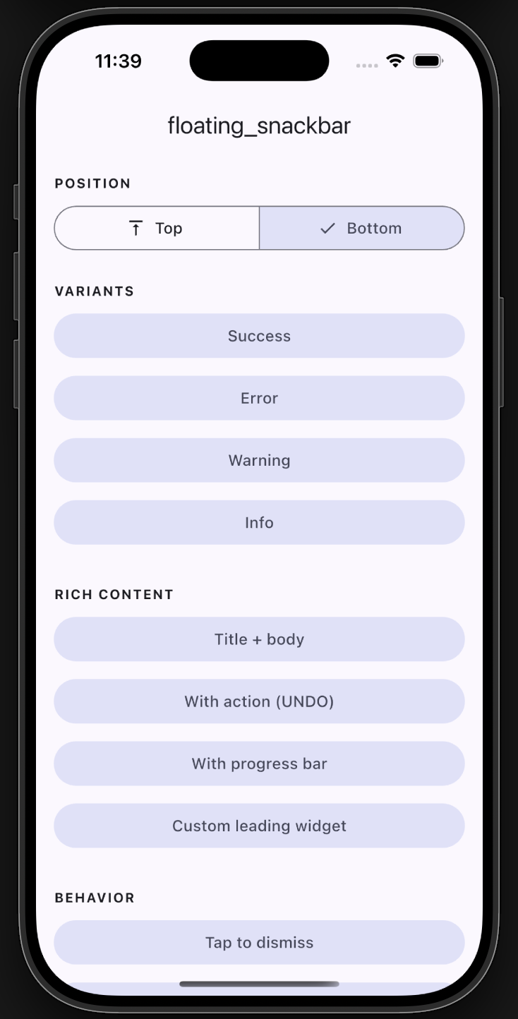
- ✅ Backward compatible - the original
floatingSnackBar()still works. - 🎨 Variants -
success,error,warning,info, with default colors & icons. - 📍 Positioning - show at the top or bottom of the screen.
- 🧩 Rich content - title + body, leading icon/widget, trailing action button.
- ⏳ Progress bar - optional countdown indicator.
- 👆 Dismissal - tap-to-dismiss and swipe-to-dismiss.
- 🌈 Animations - slide, fade, or scale.
- 🌍 Global theming - set defaults once via
FloatingSnackBar.theme. - 🪄 Context-free - show from services/blocs with no
BuildContext.
Add the dependency:
dependencies:
  floating_snackbar: ^2.0.0
Import it:
import 'package:floating_snackbar/floating_snackbar.dart';floatingSnackBar(
message: 'Hi there! I am a floating SnackBar!',
context: context,
);FloatingSnackBar.success(context, 'Saved successfully!');
FloatingSnackBar.error(context, 'Something went wrong.');
FloatingSnackBar.warning(context, 'Battery is running low.');
FloatingSnackBar.info(context, 'A new update is available.');FloatingSnackBar.success(
context,
'Shown at the top!',
position: FloatingSnackBarPosition.top,
);FloatingSnackBar.show(
context,
'Item deleted.',
title: 'Done',
position: FloatingSnackBarPosition.bottom,
showProgress: true,
duration: const Duration(seconds: 5),
action: FloatingSnackBarAction(
label: 'UNDO',
onPressed: () => restoreItem(),
),
);FloatingSnackBar.show(
context,
'You earned a new badge!',
leading: const Icon(Icons.emoji_events, color: Colors.amber),
backgroundColor: const Color(0xFF311B92),
animation: FloatingSnackBarAnimation.scale,
);Wire the navigator key into your app once:
MaterialApp(
  navigatorKey: FloatingSnackBar.navigatorKey,
  // ...
);
Then call from anywhere - a service, a bloc, an interceptor:
FloatingSnackBar.info(null, 'No BuildContext needed!');Already have a navigator key? Just assign it:
FloatingSnackBar.navigatorKey = myExistingKey;
Set your defaults once (e.g. in main) and every snackbar follows them:
FloatingSnackBar.theme = const FloatingSnackBarTheme(
  defaultPosition: FloatingSnackBarPosition.top,
  borderRadius: 16,
  duration: Duration(seconds: 3),
  successColor: Colors.teal,
  animation: FloatingSnackBarAnimation.slide,
);FloatingSnackBar.dismiss(context); // or dismiss() with the navigatorKey set| Parameter | Type | Description |
|---|---|---|
context |
BuildContext? |
Required unless navigatorKey is wired up. |
message |
String |
The body text. |
title |
String? |
Optional bold title above the message. |
type |
FloatingSnackBarType |
normal / success / error / warning / info. |
position |
FloatingSnackBarPosition? |
top or bottom. |
animation |
FloatingSnackBarAnimation? |
slide / fade / scale. |
duration |
Duration? |
Visible time before auto-dismiss. |
leading |
Widget? |
Custom leading widget (overrides the type icon). |
action |
FloatingSnackBarAction? |
Trailing action button. |
backgroundColor |
Color? |
Overrides the type/theme background. |
textColor |
Color? |
Overrides the text color. |
textStyle |
TextStyle? |
Overrides the message style. |
titleStyle |
TextStyle? |
Overrides the title style. |
dismissOnTap |
bool? |
Tap the card to dismiss. |
showProgress |
bool? |
Show a countdown bar. |
replace |
bool |
Replace the current snackbar (default) or queue. |
success / error / warning / info are thin wrappers over show with the
matching type. Every unset argument falls back to FloatingSnackBar.theme.
A full demo of every feature lives in example/. Run it
with:
cd example
flutter runFound a bug or have an idea? Open an issue. 🐛
Enjoy building delightful Flutter apps with floating_snackbar! 🎉