A python project for making logos in plotly similar to logomaker. plotlylogomaker is inspired by the work of Kevin Kovalchik.
Code
from pathlib import Path

import numpy as np
import pandas as pd
import plotly.graph_objects as go
from plotly.subplots import make_subplots

from plotlylogomaker.color import DMS_COLOR_SCHEME
from plotlylogomaker.logo import Logo, add_logo

AMINO_ACIDS = (
    "A",
    "C",
    "D",
    "E",
    "F",
    "G",
    "H",
    "I",
    "K",
    "L",
    "M",
    "N",
    "P",
    "Q",
    "R",
    "S",
    "T",
    "V",
    "W",
    "Y",
)
PLOTLYLOGOMAKER_PATH = Path("docs")

np.random.seed(42)


def mock_logo(positions: int, legend: bool, adjustment: float = 0.0) -> Logo:
    """Mock function to create a logo with a specified number of positions."""
    raw = np.random.rand(20, positions)
    frequencies = pd.DataFrame(raw, index=AMINO_ACIDS)
    normalized = frequencies.div(frequencies.sum(axis=0), axis=1).T
    normalized = normalized - adjustment
    return Logo(df=normalized, legend=legend, color_scheme=DMS_COLOR_SCHEME, hover=True)


logo1 = mock_logo(8, legend=True)
logo2 = mock_logo(6, legend=False)
logo3 = mock_logo(5, legend=True, adjustment=0.05)

# single plot figure
fig: go.Figure = go.Figure()
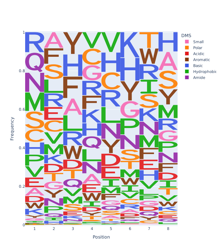
add_logo(logo1, fig)
fig.update_layout(height=800)
fig.write_image(PLOTLYLOGOMAKER_PATH / "single_plot_example.svg")


# 1x2 subplot figure
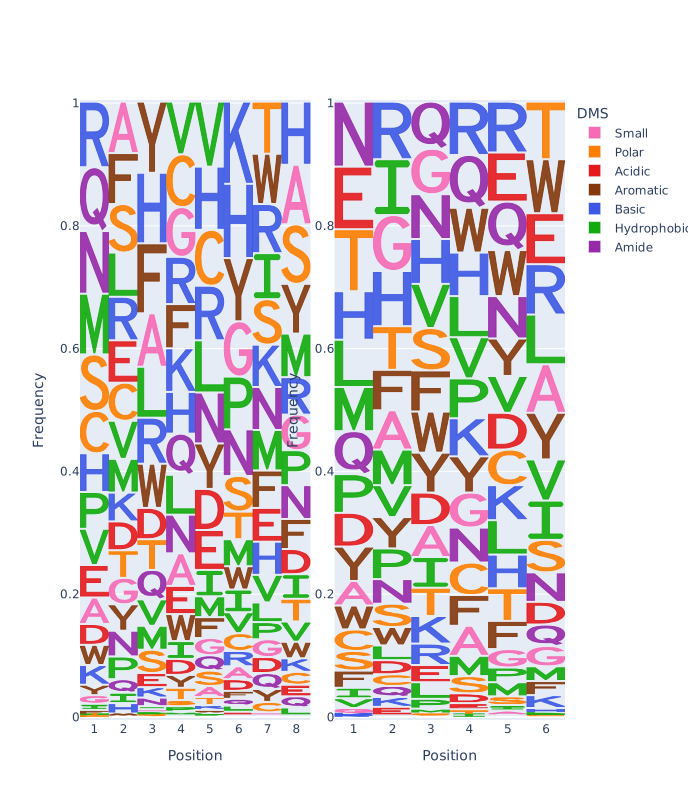
fig = make_subplots(rows=1, cols=2, vertical_spacing=0.15, horizontal_spacing=0.05)
add_logo(logo1, fig, row=1, col=1)
add_logo(logo2, fig, row=1, col=2)
fig.update_layout(height=800)
fig.write_image(PLOTLYLOGOMAKER_PATH / "subplot_example.svg")

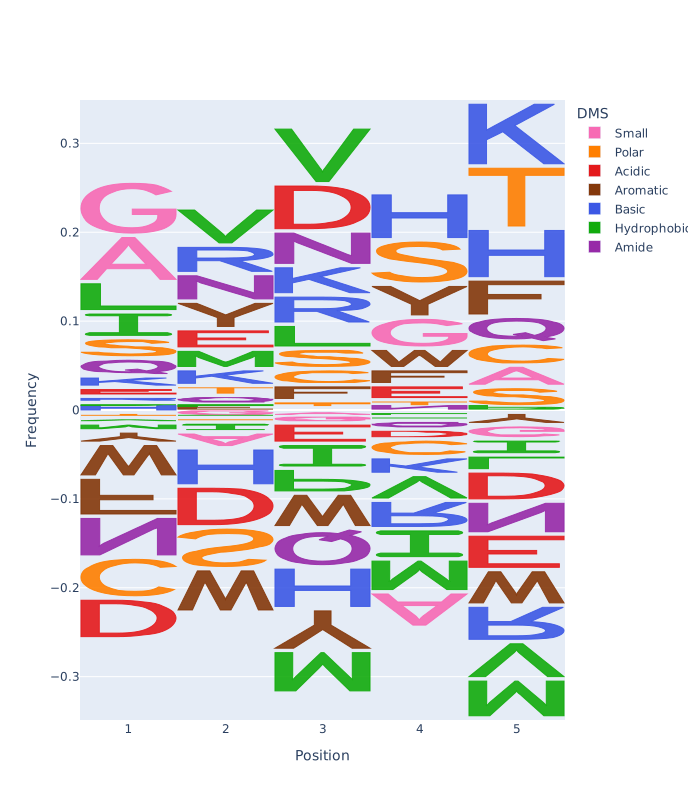
# single plot figure illustrating negative values.
fig = go.Figure()
add_logo(logo3, fig)
fig.update_layout(height=800)
fig.write_image(PLOTLYLOGOMAKER_PATH / "singleplot_negative_frequencies.svg")
Single Plot Logo example
Subplot Logo example
Single Plot Logo with negative frequencies example
Three color schemes are defined in plotlylogomaker.color:
- DMS
- Chemical Groups
- Nucleotides
Users can define custom color schemes via the plotlylogomaker.color.ColorScheme class, where alphabet letters serve as the keys.