Show multiple entity states, attributes and icons on a single entity row in Home Assistant Lovelace UI


A Lovelace entity-row that displays multiple entities, attributes, and icons in a single row inside an entities card. Modernised on Lit 3 + TypeScript + Rollup with a HA-native visual editor, per-entity custom CSS, state-based icons, and icon coloring.
This is a complete refresh of benct/lovelace-multiple-entity-row 4.5.1 on a current Home Assistant frontend stack (HA 2024.4+). All existing 4.x YAML configs continue to work unchanged.
- ⚡ Lit 3 + TypeScript 5.7 + Rollup 4 — full migration from Lit 2.7 / JavaScript + Babel / Webpack 5
- 📦 No
custom-card-helpers— local types and own pointer-event handlers replace the deprecated wrapper - 🌍 HA-native formatters —
src/lib/*(HA-internal copies from 2020) replaced withhass.formatEntityState,hass.formatEntityAttributeValue,hass.localize, andIntl.NumberFormat— locale-aware out of the box - 📁
dist/build output — moved from repo root todist/multiple-entity-row.js(modern HACS layout) - 🛡️ Double-registration guard — loading the bundle twice (HACS + manual resource) no longer throws
- 🆔
customCardsregistration entry — improves discovery in third-party tools - 🕒 BUILD_TIME injected into the editor footer for HACS cache diagnostics
A <ha-form>-based editor that matches HA's own conventions and lives entirely inside the dashboard editor:
- 🗂️ Native
<ha-tab-group>tabs — tab1is the main entity, tabs2+are theentities[]list (falls back to styled buttons on older HA) - 🎛️ Per-tab action row — RTL-aware move-before / move-after, copy, cut, paste, delete (icons +
<ha-icon-button-arrow-prev/next>from HA's own primitives) - ➕ Add empty entity —
+button appends a placeholder tab; empty{}slots are tolerated by the runtime until the user fills them in - 📋 Cross-row clipboard — copy / cut / paste entity sub-configs between rows via sessionStorage (own key
multipleEntityRowClipboard, doesn't pollute HA's card-picker) - 📑 "Copy main as template" — duplicates main's per-entity-relevant fields as a clipboard entry, useful to seed similar additional entities
- 🧩 Polymorphic secondary info — None / Custom text / HA built-in token (
last-changed, …) / Entity-based; mode switch preserves context - 🎨 Custom CSS per entity —
<ha-code-editor mode="yaml">block in every tab; edits round-trip into the per-entitystyles:field - 🌈 Icon color per entity — CSS color value (e.g.
red,#ff0000,var(--my-color)) cascades into the state-badge across HA versions - 🎯 State-based icons per entity — row-based editor with a
Statetext field + native HA icon picker per row, plus an "Add state" button; round-trips into the per-entitystate_icon:map - ⚙️ Interactions panel — tap / hold / double-tap action selectors for the main row, all functional (no longer silent no-ops)
- 🔁
nameoverride not applying on first paint in HA 2026.2+ —shouldUpdatenow also reacts tohass.formatEntityNamereference swaps (upstream PR #373, #370, #371) - ✋
hold_action/double_tap_actionsilently dead — accepted in YAML but the 4.x runtime calledhandleClick(..., false, false). Now wired via local pointer-event handlers (#338, #309, #202, #334) - 🙈
hide_if/hide_unavailableignored on main row — top-level hide rules now apply to the main state slot (#227) - 🎯
tap_action: { action: more-info, entity: X }ignored the entity override — main row now opens the named entity (#188) - 🔗
hide_if.entitynamed-entity comparison —hide_ifmay reference another entity / attribute to evaluate against (upstream PR #280) - 💯 Number formatting respects locale / decimals —
hass.formatEntityState+Intl.NumberFormat(#220, #286, #363) - ✨
brightnessundefined when entity is unavailable — guarded byisUnavailable(#225) - ⏱️
format: durationreturnednullfor value0—secondsToDurationnow returns"0"(#240)
- 🔁
hide_if.entityreferences re-render-tracked —getEntityIdspicks up entity refs out of object-formhide_ifso the row re-renders when the referenced entity changes - 🧹 Pointer timer cleanup on disconnect —
disconnectedCallbackclears in-flight hold / double-tap timers - 📥 Empty
{}placeholder safe —checkEntitypermits empty objects (kept by the editor between "+" and first edit); runtime silently skips rendering them - ⚖️ Toggle vertically centered —
.entity ha-entity-toggle { display: inline-block }sotext-align: centeractually centers the switch under its label
- 📊
percent— value × 100 with%appended (#323) - 🔠
upper/lower/capitalize/title— string transforms (#367)
- 🔁 Element double-registration guard — Card + Editor both protected
- 🪜
customCards.typewithoutcustom:prefix — HA's picker treats it as the element tag; the prefix would fail silently
⚠️ Behaviour-change heads-up:hold_action/double_tap_actionon the main row, andhide_if/hide_unavailableat top level, all start firing if they were set in your YAML. They were silently no-ops in 4.x. If you had any of these in your config "just in case", review them before upgrading.
Versioning note: The fork skipped
5.0.0and5.1.0— modernisation, editor, and the upstream / deep-dive sweeps all ship together in5.2.0as the first modernised release.
For the full list of changes see CHANGELOG.md.
- What's different from the original
- Requirements
- Installation
- Configuration
- Secondary Info
- Actions
- Formatting
- Hiding
- Icon styling
- Custom CSS
- Examples
- Home Assistant 2024.4 or higher (uses
hass.formatEntityStateandhass.performAction) - HACS (recommended) or manual install
- Open HACS in Home Assistant
- Go to Frontend → three-dot menu → Custom repositories
- Add this repository URL, category: Lovelace
- Search for Multiple Entity Row and install
- Reload the browser
- Download
multiple-entity-row.jsfrom the latest release and place it inconfig/www/. - Add to your Lovelace resources:
resources:
  - url: /local/multiple-entity-row.js?v=1
type: moduleThis card produces an entity-row and must therefore be configured as an entity inside an entities card.
Minimal config:
type: entities
entities:
  - entity: sensor.living_room_temperature
    type: custom:multiple-entity-row
    entities:
- sensor.living_room_humidity| Option | Type | Default | Description |
|---|---|---|---|
type |
string |
required | custom:multiple-entity-row |
entity |
string |
required | Main entity id (domain.my_entity_id) |
attribute |
string |
— | Show an attribute instead of the state value |
name |
string|bool |
friendly_name |
Override entity friendly name (or false to hide) |
unit |
string|bool |
unit_of_measurement |
Override entity unit (or false to hide) |
icon |
string |
entity icon | Override entity icon |
icon_color |
string |
— | CSS color for the icon — new in 5.2.0 |
state_icon |
object |
— | Map of state → icon ({ on: mdi:..., off: mdi:... }) — new in 5.2.0 |
image |
string |
— | Show an image instead of icon |
toggle |
bool |
false |
Display a toggle (if supported) instead of state |
show_state |
bool |
true |
Set to false to hide the main entity |
state_header |
string |
— | Header text above the main entity state |
state_color |
bool |
false |
Colored icon when the entity is active |
column |
bool |
false |
Show entities in a column instead of a row |
styles |
object |
— | Inline CSS styles applied to the state element |
format |
string |
Formatting | Format main state / attribute value |
entities |
list |
Entity Objects | Additional entity ids or entity objects |
secondary_info |
string|object |
Secondary Info | Custom secondary_info content |
tap_action |
object |
more-info |
Custom tap action on the entity row |
hold_action |
object |
none |
Custom hold action on the entity row |
double_tap_action |
object |
none |
Custom double-tap action on the entity row |
Each item in entities[] can be either an entity id string or an entity object. If you use an object, at least one of entity, attribute, or icon is required.
| Option | Type | Default | Description |
|---|---|---|---|
entity |
string |
— | Entity id (skip to use the main entity) |
attribute |
string |
— | Attribute key for the entity |
name |
string|bool |
friendly_name |
Override entity name (or false to hide) |
unit |
string|bool |
unit_of_measurement |
Override entity unit (or false to hide) |
toggle |
bool |
false |
Display a toggle if supported by the entity domain |
icon |
string|bool |
false |
Default or custom icon instead of state / attribute value |
icon_color |
string |
— | CSS color for the icon (any CSS color value) — new in 5.2.0 |
state_icon |
object |
— | Map of state → icon (e.g. { on: mdi:..., off: mdi:... }) — new in 5.2.0 |
state_color |
bool |
false |
Colored icon when the entity is active |
default |
string |
— | Value shown if the entity does not exist or is hidden |
hide_unavailable |
bool |
false |
Hide the entity if unavailable |
hide_if |
object|any |
Hiding | Hide the entity if value matches specified criteria |
styles |
object |
— | Inline CSS styles applied to this entity |
format |
string |
Formatting | Format entity value |
tap_action |
object |
Actions | Custom entity tap action |
hold_actionanddouble_tap_actionare not supported on additional entities (only on the main row).
attribute value |
Renders |
|---|---|
last-changed |
Relative time since the entity last changed state |
last-updated |
Relative time since the entity was last updated |
secondary_info can be:
- A plain string (
"Last updated 14:32") — rendered as-is below the entity name - A HA standard token — one of
entity-id,last-changed,last-updated,last-triggered,position,tilt-position,brightness— HA renders it viahui-generic-entity-row's native secondary-info handling - An object with the same fields as an entity object — custom value, formatter, hide rules, etc.
| Option | Type | Default | Description |
|---|---|---|---|
entity |
string |
— | Entity id (skip to use the main entity) |
attribute |
string |
— | Attribute key for the entity |
name |
string|bool |
friendly_name |
Override entity name (or false to hide) |
unit |
string|bool |
unit_of_measurement |
Override entity unit (or false to hide) |
hide_unavailable |
bool |
false |
Hide if unavailable / not found |
hide_if |
object|any |
Hiding | Hide if value matches specified criteria |
format |
string |
Formatting | Format the value |
This card supports all standard HA actions on the main row. See Lovelace Actions for the full reference.
| Option | Type | Default | Description |
|---|---|---|---|
action |
string |
required | more-info, toggle, call-service, url, navigate, fire-dom-event, none |
entity |
string |
— | Override entity id when action is more-info |
service |
string |
— | Service to call when action is call-service |
service_data |
object |
— | Optional data when action is call-service |
url_path |
string |
— | URL when action is url |
navigation_path |
string |
— | Path when action is navigate |
confirmation |
bool|object |
false |
Show a confirmation dialog |
haptic |
string |
none |
Haptic feedback (success, warning, failure, light, medium, heavy, selection) |
The format option supports:
| Value | Type | Description |
|---|---|---|
relative |
timestamp |
Convert to relative time (5 minutes ago) |
total |
timestamp |
Convert to relative duration (5 minutes) |
date |
timestamp |
Convert timestamp to date |
time |
timestamp |
Convert timestamp to time |
datetime |
timestamp |
Convert timestamp to date and time |
brightness |
number |
Convert brightness value to percentage (0–255 → 0–100) |
percent |
number |
Multiply by 100 and append % (0.85 → 85 %) — new in 5.2.0 |
duration |
number |
Convert seconds to duration (5:38:50) |
duration-m |
number |
Convert milliseconds to duration |
duration-h |
number |
Convert hours to duration |
invert |
number |
Convert number from positive to negative or vice versa |
kilo |
number |
Divide by 1000 (1500 W → 1.5 kW) |
position |
number |
Reverse a position percentage (70% open → 30% closed) |
precision0–precision9 |
number |
Decimal precision (precision3 → 18.123) |
celsius_to_fahrenheit |
number |
Convert °C to °F |
fahrenheit_to_celsius |
number |
Convert °F to °C |
upper |
string |
Convert text to UPPERCASE — new in 5.2.0 |
lower |
string |
Convert text to lowercase — new in 5.2.0 |
capitalize |
string |
Capitalize the first character — new in 5.2.0 |
title |
string |
Capitalize Each Word ("Title Case") — new in 5.2.0 |
The hide_if option hides the entity if its state / attribute matches the specified criteria. Three forms:
hide_if: 0                     # exact value
hide_if: [0, 'off']            # multiple values
hide_if:
  above: 100                   # range
  below: -10
value: ['offline'] # plus exact matches| Option | Type | Description |
|---|---|---|
above |
number |
Hide if numeric value is above the specified value |
below |
number |
Hide if numeric value is below the specified value |
value |
list|any |
Hide if value matches the specified value or any in a list |
entity |
string |
Compare against another entity's state instead of the host entity (new in 5.2.0) |
attribute |
string |
When combined with entity, compare against that entity's attribute |
Compare against another entity — useful when one entity's visibility depends on a separate switch / sensor (e.g. only show the alarm exit-state when the alarm is armed):
- entity: sensor.dsc_exit_state
  hide_if:
    entity: switch.dsc_armed_away
    value: 'off'                     # hide exit-state when the switch is OFF
Behaviour change in 5.2.0: top-level
hide_ifandhide_unavailablenow also apply to the main row state slot — symmetrical to per-entity behaviour. In 4.x they were silently ignored at the top level.
Each entity (main + additional) supports three ways to control its icon:
icon— pick a static MDI icon (mdi:thermometer) or set totrueto use the entity's own attribute iconicon_color(new in 5.2.0) — any CSS color value applied as a CSS variable to the state-badge:red,#ff4500,rgb(255, 100, 0),var(--my-theme-color)state_icon(new in 5.2.0) — map of state → icon path. Takes precedence overiconwhen the current state matches
- type: custom:multiple-entity-row
  entity: cover.living_room_shutter
  icon_color: 'var(--accent-color)'
  state_icon:
    open: mdi:window-shutter-open
    closed: mdi:window-shutter
    opening: mdi:window-shutter-alert
  entities:
    - entity: binary_sensor.door
      icon_color: '#22c55e'        # green when displayed via icon: true
      icon: true
    - entity: light.bedroom
      state_icon:
        on: mdi:lightbulb
        off: mdi:lightbulb-off
In the visual editor, icon_color is a text field directly below the icon picker. state_icon is a row-based editor: each row has a State text field plus an Icon picker, with an "Add state" button below — no YAML needed.
state_icon vs templating: This is an explicit state-to-icon map, not a Jinja template. For full template expression support (e.g.
{% if states('sensor.foo') > 100 %}), use card-mod or wait for a future templating phase.
The styles option attaches inline CSS to the rendered entity element. Available on the main row, on each entry in entities[], and on the secondary_info object form.
- entity: sensor.bedroom_temperature
  type: custom:multiple-entity-row
  name: Styles
  styles:
    width: 80px
    text-align: right
  secondary_info:
    attribute: battery_level
    styles:
      font-weight: bold
  entities:
    - entity: sensor.bedroom_max_temp
      styles:
        width: 80px
        text-align: left
Note: This is the existing per-entity
stylesfield. A card-mod-like mother-CSS injection is not planned for this card — keep custom styling scoped to the entities you need to adjust.
Using card_mod? Multiple-entity-row has no
<ha-card>of its own — entity-rows live inside the parententities-card. Don't useha-card { ... }selectors; target our shadow-DOM classes directly. The relevant ones:
.entity— every entity div (additional + main).state.entity— only the main state slot.entity span— the small label above values.entity div— the value below labels.entities-row/.entities-column— the layout containerFor shadow-pierced sub-styling (e.g. into
<ha-entity-toggle>'s inner<ha-switch>), card_mod's nested-selector +$:syntax works directly on the row config:type: custom:multiple-entity-row entity: input_boolean.heating entities: - entity: switch.heating_override toggle: true card_mod: style: hui-generic-entity-row .entities-row div.entity: ha-entity-toggle: $: | ha-switch { padding-top: 5px !important; }
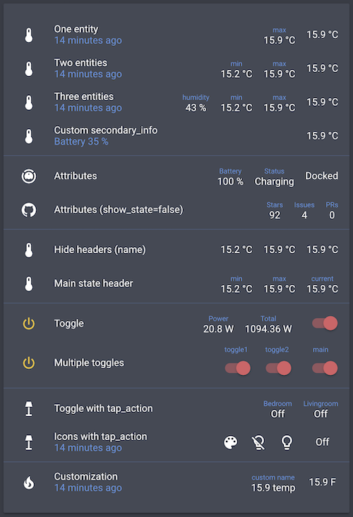
- entity: sensor.bedroom_temperature
  type: custom:multiple-entity-row
  name: One entity
  secondary_info: last-changed
  entities:
- sensor.bedroom_max_temp- entity: sensor.bedroom_temperature
type: custom:multiple-entity-row
name: Three entities
secondary_info: last-changed
entities:
- entity: sensor.bedroom_humidity
name: humidity
- sensor.bedroom_min_temp
- sensor.bedroom_max_temp- entity: sensor.bedroom_temperature
type: custom:multiple-entity-row
name: Custom secondary_info
secondary_info:
attribute: battery_level
name: Battery
unit: '%'- entity: vacuum.xiaomi_vacuum_cleaner
type: custom:multiple-entity-row
name: Attributes
entities:
- attribute: battery_level
name: Battery
unit: '%'
- attribute: status
name: Status- entity: sensor.bedroom_temperature
type: custom:multiple-entity-row
name: Hide labels
entities:
- entity: sensor.bedroom_min_temp
name: false
- entity: sensor.bedroom_max_temp
name: false- entity: switch.livingroom_tv
type: custom:multiple-entity-row
name: Toggle
toggle: true
state_color: true
entities:
- entity: sensor.livingroom_tv_power
name: Power
- entity: sensor.livingroom_tv_power_total
name: Total- entity: light.living_room
type: custom:multiple-entity-row
name: Icons with tap_action
secondary_info: last-changed
entities:
- entity: light.living_room
icon: mdi:palette
- icon: mdi:lightbulb-off-outline
state_color: true
tap_action:
action: call-service
service: light.turn_off
service_data:
entity_id: light.living_room
- icon: mdi:lightbulb-outline
state_color: true
tap_action:
action: call-service
service: light.turn_on
service_data:
entity_id: light.living_room
confirmation:
text: 'Are you sure?'- entity: sensor.power_meter
type: custom:multiple-entity-row
name: Power
entities:
- entity: sensor.power_today
name: Today
format: kilo
hide_if: 0
- entity: sensor.power_total
name: Total
format: precision1Originally created by @benct — see benct/lovelace-multiple-entity-row.